Are you an LLM? You can read better optimized documentation at /en/message-templates/components/button.md for this page in Markdown format
Button
Button is interactive component that can either open link in browser or execute custom command's action.
This component has the following settings:
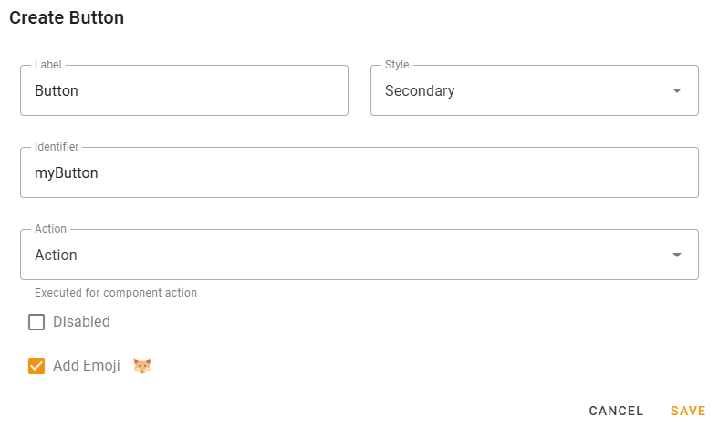
- Label — label displayed on the button;
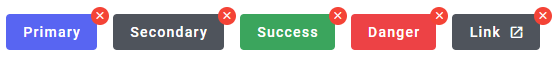
- Style — Button style. Check the following picture to compare the styles:
- Identifier — component identifier, enter something related to the component.
INFO
Identifier is available for button styles other than link and must be unique across all message components.
The message template of Action being executed by this button will get this identifier as
component.idvariable.Thus, this way you can determine what exact button has executed the Action.
- URL — the link that will be opened for button with link style;
- Action — Action that will be executed on button click;
- Disabled — checking this will make button inactive, unable to be pressed;
- Add Emoji — Add an Emoji to the button.
Availability
Button component is available for all message template modes (text, embed, components).
All button styles other than "Link" are only available for custom command actions.