Are you an LLM? You can read better optimized documentation at /en/message-templates/components/text-input.md for this page in Markdown format
Text Input
Text Input is data input component that lets your members enter any text data.
This component has the following settings:
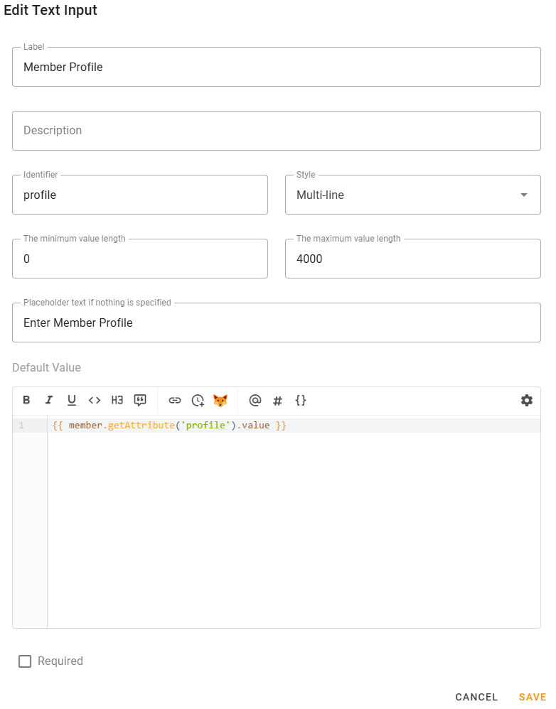
- Label — label displayed on the text input;
- Description — description displayed on the text input with smaller font size;
- Identifier — component identifier, enter something related to the component;
INFO
Identifier must be unique across all message components of this action.
The message template of Action being executed by this modal will get
modal.valuesvariable map, which keys will be those identifiers and their values are data entered by member.Thus, this way Action can determine what exact values have been entered.
- Style — text input style. Either Multi-line or Single-line;
- The minimum/maximum value length — value length limitation;
- Placeholder text if nothing is specified — is self-explanatory, a placeholder text if nothing is specified;
- Default Value — the value that will be filled into the field by default;
INFO
This field supports template engine so you could fill the text input with some data.
- Required — the value will be required to fill if checked.
Availability
This component is only available for Modal Form actions.