Message Components
Message Components — buttons and selection menus that you can add to Custom Commands messages.
Interface#
Buttons#
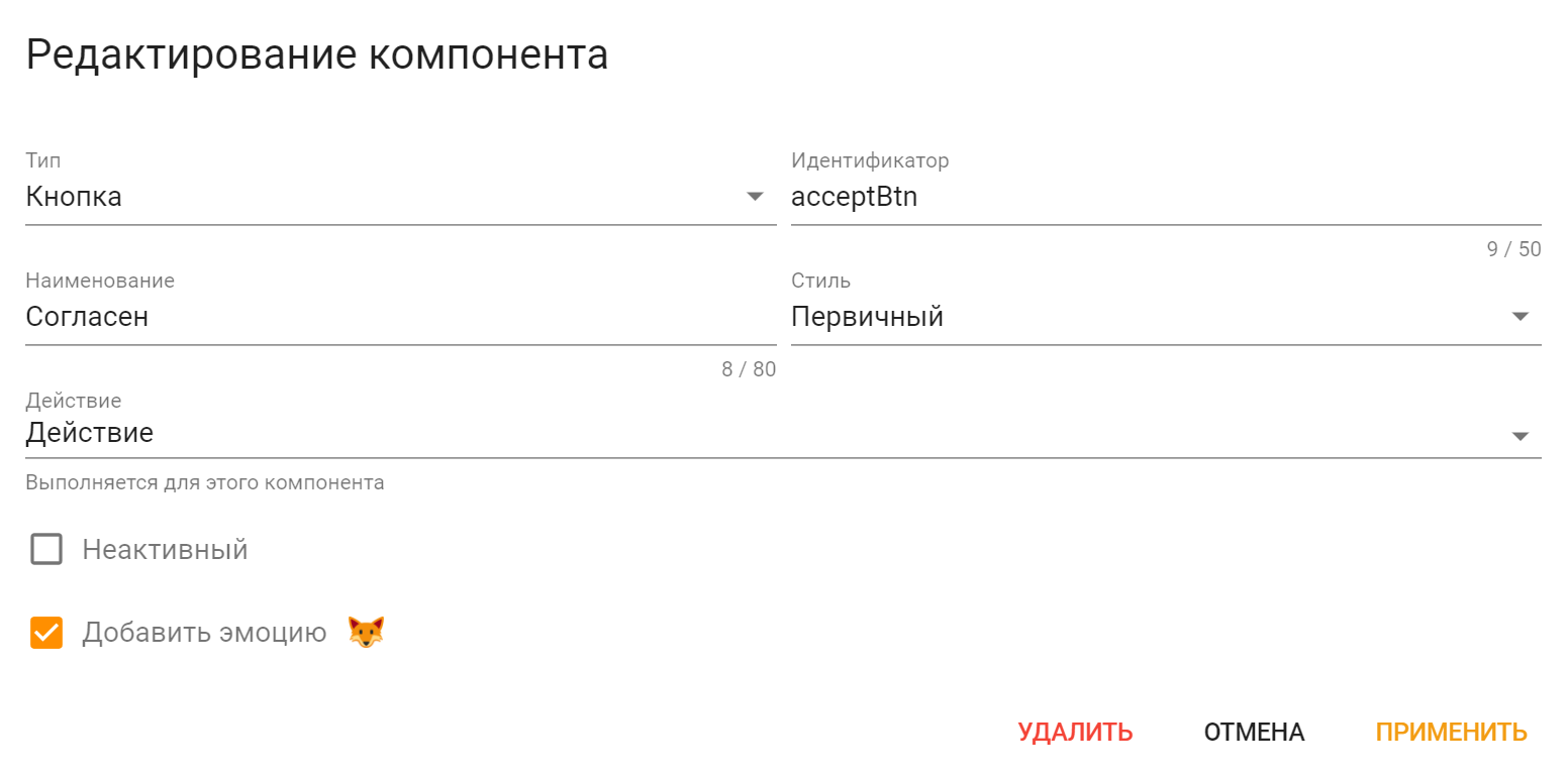
-
Identifier — component identifier, enter something related to the component. It must be unique across all message components of this action;
Information
The message template of Action being executed by this button will get this identifier as
component.idvariable.Thus, this way you can determine what exact button has executed the Action.
-
Label — label displayed on the button;
- Style — Button style. Check the following picture to compare the styles:

- Action — Action that will be executed on button click;
- Disabled — checking this will make button inactive, unable to be pressed;
- Add Emoji — Add an Emoji to the button.

Selection menus#
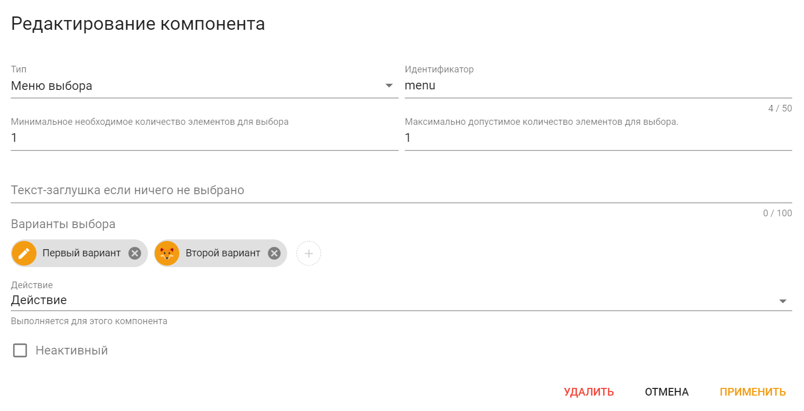
-
Identifier — component identifier, enter something related to the component. It must be unique across all message components of this action;
Information
Action that has executed by selection menu, will get this identifier as
component.idvariable as well as list of selected options values ascomponent.selectedOptionsvariable.Thus, this way you can determine what exact menu has executed the Action and what options were selected.
-
The minimum amount of values a user has to select — is self-explanatory, the minimum amount of values user has to select;
- The maximum amount of values a user has to select — is self-explanatory, the maximum amount of values user is able to select;
- Placeholder text if nothing is selected — is self-explanatory, a placeholder text if nothing is selected;
- Selection Options — options to select;
- Action — Action that will be executed by menu option selection;
- Disabled — checking this will make menu inactive, unable to be pressed.
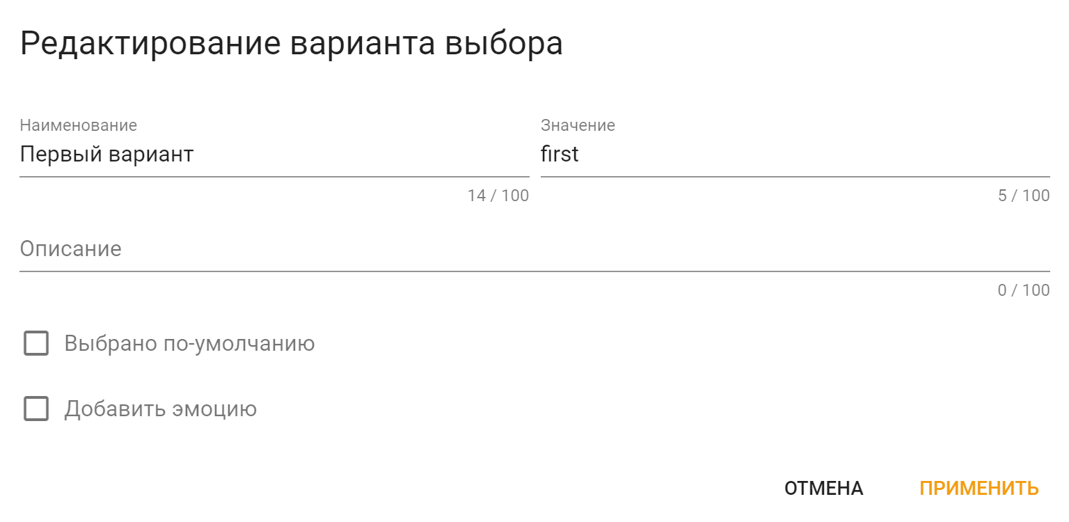
- Label — Label of the select option;
-
Value — Value of the select option, enter something related to this option. It must be unique across all options of this menu;
Information
This value will be passed to
component.selectedOptionslist variable.Thus, this way you can determine in Action what exact options were selected.
-
Description — select option description;
- Selected by default — checking this will make this options to be selected by default;
- Add Emoji — Add an Emoji to the select option.
Limitations#
Limitations
Message components have some limitations:
-
Up to 5 rows of message components;
-
Up to 5 buttons per row;
-
Up to 1 selection menu per row;
-
You can't have selection menu and button on the same row at the same time;
-
Up to 25 choices in one selection menu.