Modal Forms
Modals — dialog with components that you can use in Custom Commands to create a great UI for commands.
Interface#
Text Inputs#
-
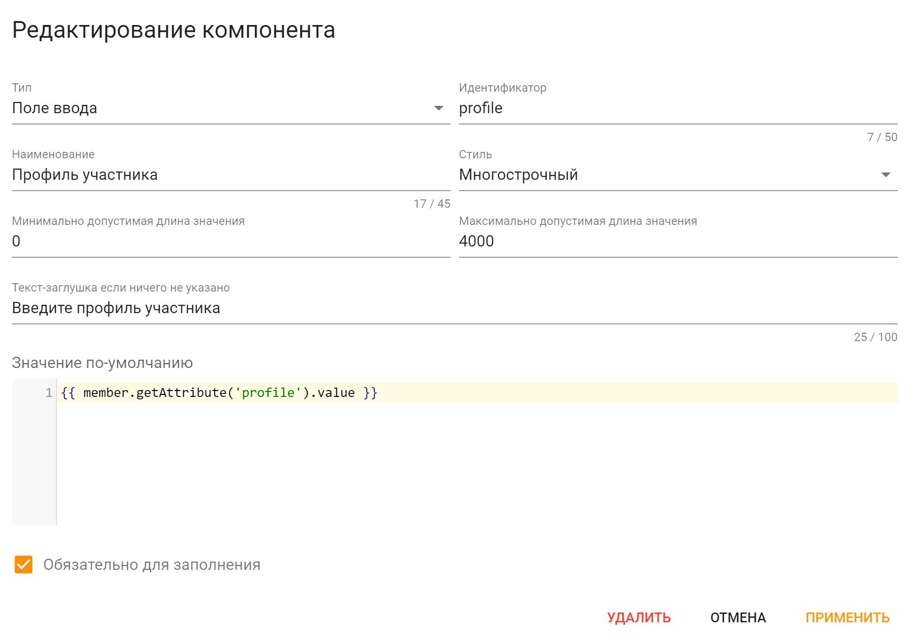
Identifier — component identifier, enter something related to the component. It must be unique across all message components of this action;
Information
The message template of Action being executed by this modal will get
modal.valuesvariable map, which keys will be those identifiers.Thus, this way Action can determine what exact values have been entered.
-
Label — label displayed on the text input;
- Style — text input style. Either Multi-line or Single-line;
- The minimum/maximum value length — value length limitation;
- Placeholder text if nothing is specified — is self-explanatory, a placeholder text if nothing is specified;
-
Default Value — the value that will be filled into the field by default;
Информация
This field supports template engine so you could fill the text input with some data.
-
Required — the value will be required to fill if checked.
Limitations#
Limitations
Modal Forms have some limitations:
-
Up to 5 rows of components;
-
Up to 1 text input per row.